
Every procurement leader has received the letter. It arrives quarterly, sometimes monthly, from a supplier you've worked with for years. The language is always the same. Raw material costs have increased. Commodity indices are up. Freight rates, energy surcharges, regulatory burden—the specifics vary, but the structure doesn't. A paragraph of justification, a percentage, and a new effective date.
You push back. You negotiate. Maybe you get the increase down from 8% to 5%. You call that a win. The letter goes into a folder. The new pricing takes effect. Everyone moves on.
Here's the problem: almost nobody checks whether the story in the letter is true.
The Narrative Gap
Supplier price increase letters are narratives. They describe a causal chain: input costs went up, therefore our prices must go up. The implicit claim is that the increase is market-driven—that the supplier is passing through commodity movements, not capturing margin.
That claim is testable. Commodity indices are public. The Bureau of Labor Statistics publishes Producer Price Index data for hundreds of materials. Steel, aluminum, plastics, chemicals, lumber—every major input has a tracked index. If a supplier says their costs went up 12% because steel went up 12%, you can check. You can pull your line-item pricing history, overlay it against the relevant PPI, and see whether your supplier's pricing actually tracks the market.
In practice, almost no one does this. Not because procurement teams are negligent, but because the analysis is genuinely difficult to build. PO data lives in one system. Commodity indices live in another. Matching unit pricing to the relevant index over time, by supplier, by part number, by facility—that's not a dashboard filter. It's a data engineering and analytical modeling problem. So the letter becomes the record. The narrative becomes the truth.
Market-Driven vs. Supplier-Driven Variance
When you build the analytical infrastructure to overlay line-item spend against commodity indices, a concept emerges that most procurement organizations don't have language for: the distinction between market-driven variance and supplier-driven variance.
Market-driven variance is the portion of your price movement that can be explained by the underlying commodity index. If steel goes up 10% and your unit price goes up 10%, the variance is market-driven. Your supplier passed through the commodity movement. That's legitimate.
Supplier-driven variance is everything else. It's the gap between what the market did and what your supplier charged. It includes margin capture, contract ratchets, volume decommitment penalties, operational inefficiencies the supplier is passing through, and pricing changes that have no relationship to the commodity index at all.
Most procurement teams negotiate as if all variance is market-driven, because they don't have the data to prove otherwise. That's the gap. When you can quantify how much of your price movement is supplier behavior versus market movement, you negotiate differently. You renegotiate with evidence.
What This Looks Like
We built the analytical layer to do exactly this. The view below shows what becomes visible when you overlay line-item unit pricing against the relevant commodity index, broken out by supplier, over time.
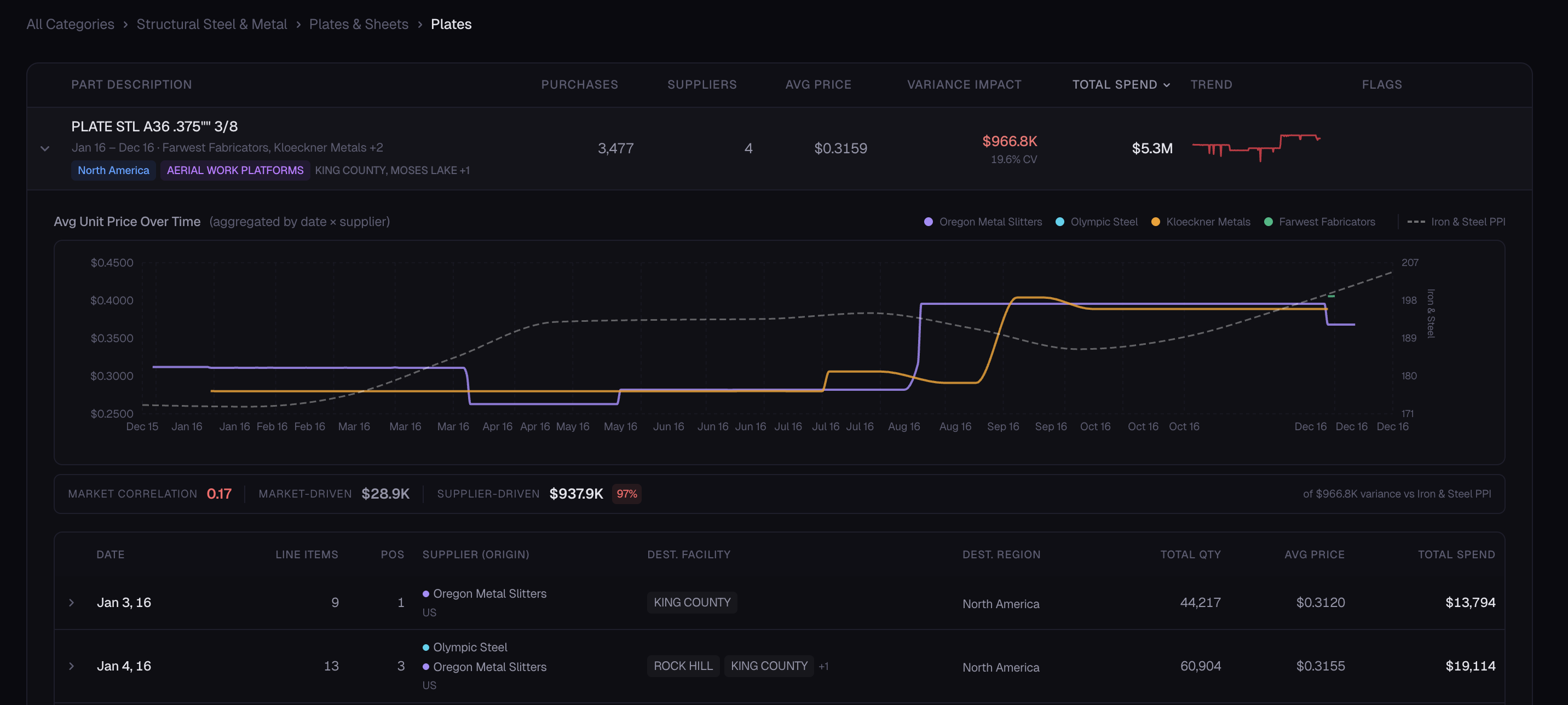
Several things become immediately apparent when you have this view.
First, you can see which suppliers track the commodity index and which ones don't. Some suppliers move in lockstep with the market. Their pricing goes up when the index goes up and comes down when it comes down. Others diverge. Their pricing increases when the market increases, but it doesn't decrease—or doesn't decrease as much, or doesn't decrease as quickly—when the market pulls back.
Second, you can see the asymmetry problem. Commodity markets are bidirectional: they go up and they come down. But supplier pricing tends to be asymmetric—increases get passed through quickly, decreases don't. Everyone in procurement knows this intuitively. Almost nobody can prove it with their own data, at the line-item level, across their full supplier base. That's the real cost of not having this analysis: you're negotiating against a narrative you can't verify.
Third, you can quantify the split. What percentage of your total variance is market-driven? What percentage is supplier-driven? When the answer is that the market explains a small fraction of your price movement and the rest is supplier behavior, you have a fundamentally different negotiation than you had before.
Why This Analysis Doesn't Exist in Most Organizations
The reason most procurement teams can't do this isn't a lack of will. It's infrastructure.
Most procurement analytics platforms are built for category-level dashboards and spend classification. They'll tell you how much you spend on steel. They'll classify your suppliers into tiers. They'll produce a quarterly spend report that looks good in a deck.
What they won't do is overlay your unit pricing against the Producer Price Index by supplier, by part number, by month, and flag the divergences. That requires a different kind of system: commodity index integration, line-item normalization, time-series correlation, and the ability to decompose variance into market and supplier components at scale. It's not a visualization problem. It's a data engineering and analytical modeling problem.
The consequence is that the price increase letter remains unchallenged. Not because procurement accepted it, but because the analytical infrastructure to challenge it doesn't exist.
The Asymmetry Isn't Accidental
It's worth being direct about what the asymmetry pattern means. When a supplier raises prices in lockstep with a commodity spike and then doesn't lower them when the index drops, that's not a market pass-through. That's margin capture.
Some of it is defensible. Suppliers have fixed costs, hedging positions, and long-term contracts with their own suppliers that don't move at the speed of the spot market. Not every divergence from the index is opportunistic.
But some of it is. And the difference between the defensible kind and the opportunistic kind is invisible without the analytical layer to see it. When all you have is a letter and a category-level spend report, you can't distinguish between a supplier who genuinely can't lower prices and one who simply hasn't been asked to justify why they haven't.
The asymmetry persists because no one has the data to call it out.
What Changes When the Infrastructure Exists
When you can decompose variance into market and supplier components at the line-item level, several things change.
Negotiation becomes evidence-based. Instead of pushing back on a percentage, you walk into a supplier review with a chart that shows their pricing diverging from the index they cited in their own increase letter. The conversation shifts from “we think this is too high” to “the index moved 4% and you moved 11%—walk us through the other 7%.”
Supplier segmentation gets sharper. You can identify which suppliers track the market faithfully and which ones don't. That's not just a negotiation tool—it's a sourcing strategy input. Suppliers who pass through market movements honestly are suppliers you want to consolidate volume with. Suppliers who consistently capture margin above the index are suppliers you should be qualifying alternatives for.
Contract structures improve. When you understand the relationship between your pricing and the underlying commodity, you can write contracts that reflect it. Index-linked pricing with defined pass-through mechanisms. Ceiling and floor provisions tied to specific PPI thresholds. Escalation clauses that reference the actual index instead of leaving the justification to a letter.
The CFO gets a real answer. Finance teams increasingly ask procurement to explain cost increases. “Steel went up” is a story. “The Iron & Steel PPI increased 6.2% over the period, our blended unit price increased 14.3%, and we've identified the specific suppliers and part numbers driving the 8.1-point gap” is an answer. The difference is the analytical infrastructure underneath.
The Question
If you run procurement for an organization with meaningful commodity-linked spend, there is one question worth asking:
Can you take your top commodity category, pull the last 18 months of line-item pricing by supplier, and overlay it against the relevant PPI? If you can, look at what happens when the index drops. Do your prices drop with it, at the same rate, on the same timeline? If they don't, you now know where to look. If you can't build the overlay at all—that's the problem.
The price increase letter is a story. Most procurement teams don't have the infrastructure to fact-check it. The ones that build it tend to find that the story and the data don't always agree.
And in procurement, the gap between the story and the data is where the money is.